Ed..good progress. Testing is a big deal. I've spent an entire week+ futzing with samples before I get to where I want to go.
I agree with your comments on the last sample pic. A rich red can look gorgeous..pinky in color..not so much. Using alcohol as the dye carrier..also a good choice as long as it doesn't bother the veneer adhesive. The dye-carrier often comes down to personal preference as the dye application is forgiving in any case. With veneer being touchy to much sanding(due to it being very thin), and water often raising grain & requiring sanding, alcohol avoids those issues. Also..also..great practice to do the full potential finish schedule on a sample from wood to dye to shellac to topcoats. This reduces any surprises.
Regarding your finish schedule:
1) Mix bright red trans tint with alcohol and apply to veneer, follow with light sanding, reapply if needed(?)
Comment: Bright red or whatever you end up with. Alcohol is fine and sanding may not be needed.2) Apply blonde shellac from spray can (does this need to be sanded and applied more than once?)
Comment: As I mentioned earlier, with good technique(start spraying before you pass over the surface and stop after you're past the surface-edge..using more cans is better than taking the chance on messing up) you may be in good shape with spray can shellac. Your overall surfaces you'll be spraying are right-sized for a spray can. Doing a larger table (flat surface) with a spray can..won't work as it'll be too tough to get a uniform appearance. One good coat of shellac will probably be ok to seal the surface. "Good" meaning a continuous thin coat of shellac without it getting too thick or too thin..making it discontinuous. Subjective I know..it's a "know it when you see it" thing. You might practice a little on cardboard with good lighting to examine what you're doing while it's wet. You'll see what "right" looks like. Shellac dries fast and offers little opportunity for 'fixing' things. If you try to fix it, it'll just get worse. Shellac can be removed with a wet rag (alcohol), but this may impact the dye underneath. It's a slippery slope..it's best to just not mess up. Again..one coat should be fine and a little very light sanding (300-400 grit) will smooth it out. Use a sanding block to keep an even pressure overall, and be very careful on the edges. 3)Apply Arm-R-Seal gloss, multiple coats, sanding with progressively finer sandpaper between coats
Comment: Sure. A practice run with applying AR-Seal on a wider surface with multiple coats may be time well spent. Good technique matters here too to get an even appearance. Maybe you have a piece of cheap maple-veneered plywood laying around? Do the full desired-finish schedule on it. Don't worry so much about what the dye looks like (maple blotches badly)..focus on the topcoat appearance-development-technique. Typically..2-3ish coats of AR-Seal is plenty for a natural look and great protection. More than that will start to build up. It depends on what you're after. I've not done more than 4 coats with AR-Seal. You might try the blue, lint-free, pattern-free, paper-like rolls of shop towels (home depot?) as the applicator. Avoid any in-towel embossed patterns as that pattern will end up in your finish at some point. I often burn the finish soaked towels right away..fast-safe way to get rid of them. Oily rags are hazardous.. _____________
More off the top of my head thoughts..
Your burl vs sapele image tells the tale to some extent. The chatoyance available in the sapele offers many opportunities to finish light, dark, or in between and the contrast/depth will still be there. The burl-grain looks to have more of a flat-monotone appearance in that it accepts dye in a more uniform manner(little contrast). When the grain has a flat (no chatoyance) appearance..I've never been able to wake it up and get chatoyance/contrast from it, no matter what I've tried...with one, sort of exception. I've worked on quarter-sawn sycamore that has the flat appearance of your burl..beautiful grain, but no glow. On wood like this you (I) just make the most of what you see in the wood. I would be careful with going too dark in dye-color as you'll start to lose the detail in the wood you have..it'll get dark and all look somewhat the same. Of course, the 40-coat high gloss finish on the goal-pics you posted can make "dark-low-contrast" look spectacular.
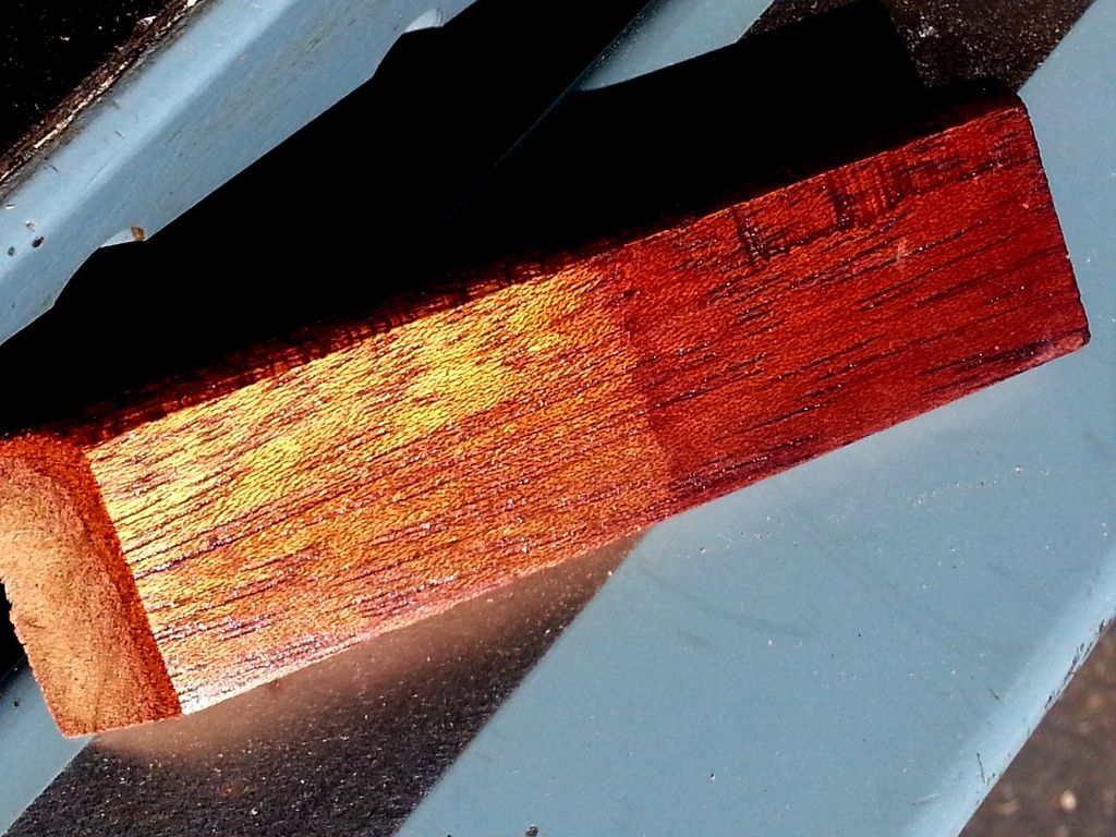
One option you might consider. I worked out a path to a "Michaels Cherry" mission finish on q-sawn white oak that I like a lot and I've used color variations on that path a number of times with good results. I sand the wood, then apply Transtint #6001 Honey Amber. The result is a piece of furniture that is canary-yellow..it's un-nerving the first time you do it. Then comes a coat of shellac to seal it in. Then (for Michaels Cherry look..reddish medium brown) wipe on the General Finishes Georgian Cherry gel stain, wipe dry at 90 degrees to grain(keeps dark gel in grain crevasses), let dry, optionally hit it with shellac to seal it, then topcoat. I've used the 6001>shellac>different color gel stain route too..looks nice. You end up with an appearance of the yellow highlights under the first coat of shellac toned by the overall color of the gel stain. In general some "wood-level highlights" are added where none existed. This path might be worth a shot in a sample... Below is a pic of this path on mahogany..not a great pic, but it's better than nothing(on left 6001 yellow dye covered with shellac, on right the gel stain added on top of yellow/shellac):
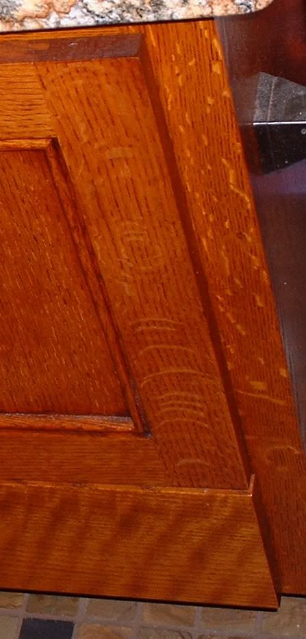
Another lousy pic of a bath vanity, q-sawn white oak>6001 yellow dye>shellac>brown gel stain>shellac>acrylic topcoat:
As you know..there's an infinite number of options/combinations..I just use my gut and go with it..