Couldn't agree more.
I like the Mpad interface (though it has its quirks, ie deleting a singe file in a playlist is impossible?, no iOs-swipe), find the Max quite basic and user-unfriendly, again the playlist feature is a major step back from just throwing in a cd.....(as opposed to it being an extra, it is now the only way, and accidentally hitting a song again adds it to the playlist again,) but the front-display at this moment is useless. Visual feedback is very necessary to be able to use the buttons in the desired way. Basic Human Computer Interface.
Just try any set of tracks with longer tracknames than the display allows for. Right now I'm playing Vivaldis Gloria by Gardiner. Most relevant info is not to be found in the display: the name of the music part. Visible are the composer and the compositionname.......Not even tracknumber.
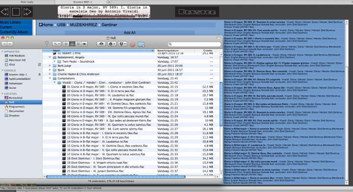
on the left you see the finder with tracknumbers, behind that on the right the Max interface, without tracknumbers, you get the idea of what is showing on the frontdisplay.....Gloria in D major, line below: Antonio Vivaldi....
Bryston must be able to do better. But you know all that and are working on it, right? #fingercrossed
Hope you will!
Thanks,
Marius
One shouldn't have to buy an Apple product (I refuse to) nor have to have a PC's web browser open in order to see relevant info. No matter how elated you are to have to buy other hardware in order to make a 2200 dollar player usable, I for one do not feel one should have to subsidize any company external to Bryston in order to do it. If I can do it (scroll song/video titles for miles) on a 16x2 display on my MythTV box (Like the BDP, it too is PC hardware running Linux), Bryston can surely do it on the BDP. I love Bryston too but I will not be an apologist for them when I know the hardware and OS is capable of doing something this basic.