Hi Chris,
Did my request to streamline the 'Back, Dashboard and Mediaplayer' buttons ever reach you?
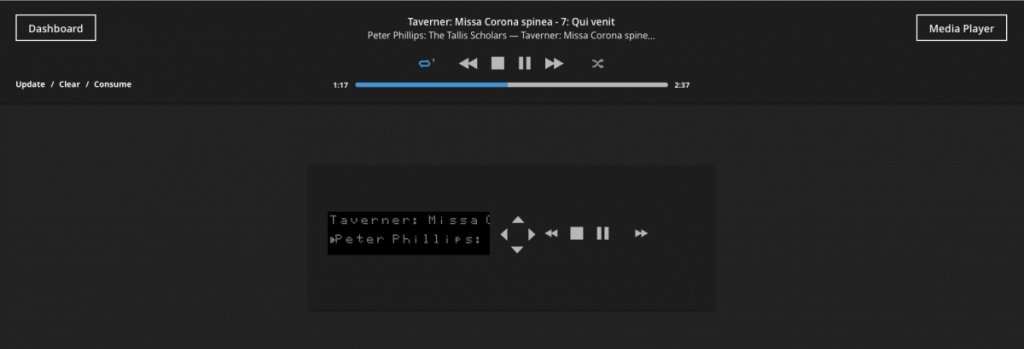
Please consider always displaying both Dashboard (left) and Mediaplayer (right), as you do on the virtual frontpanel page (see enclosed pic). With the obvious exception of the Dashboard and Mediaplayer pages themselves.
Also, 'Back' could always be replaced by Dashboard, thus simplifying the interface even further.
Above would make the interface faster (one doesn't need to go back to the dashboard anymore to load Mediaplayer from within the settings tabs, since the button Mediaplayer would always be there) and Back wouldn't be necessary, Dashboard will do better (and be more exact, since it goes back to Dashboard...) and take out the confusion it might cause on some pages, where Back isn;t as clear as it could be when called Dashboard

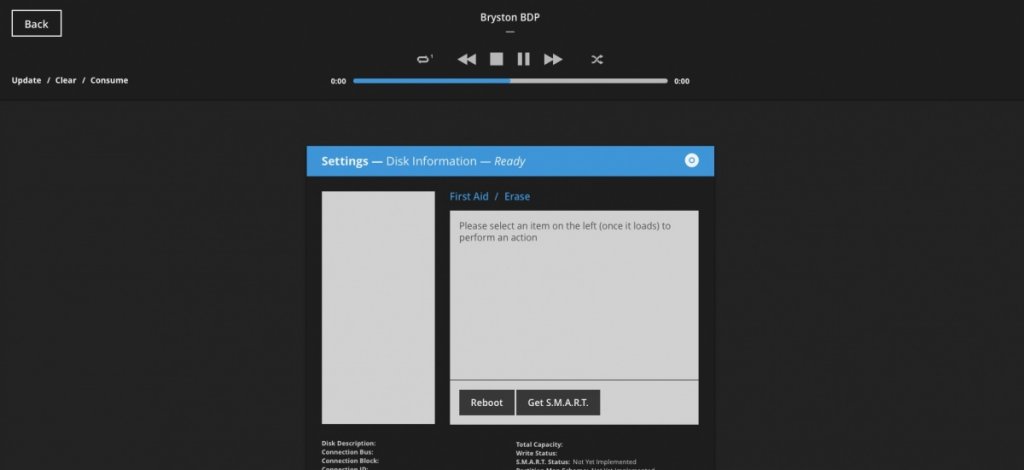
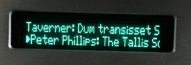
on the VFP: as shown it doesn't fully reflect what is shown on the real front panel, which is wider and contains more characters, could you please correct that? Ive used this VFP often for testing purposes, checking the BDP. It would be most helpful if it correctly shows what is displayed on the real frontpanel.
Cheers,
Marius